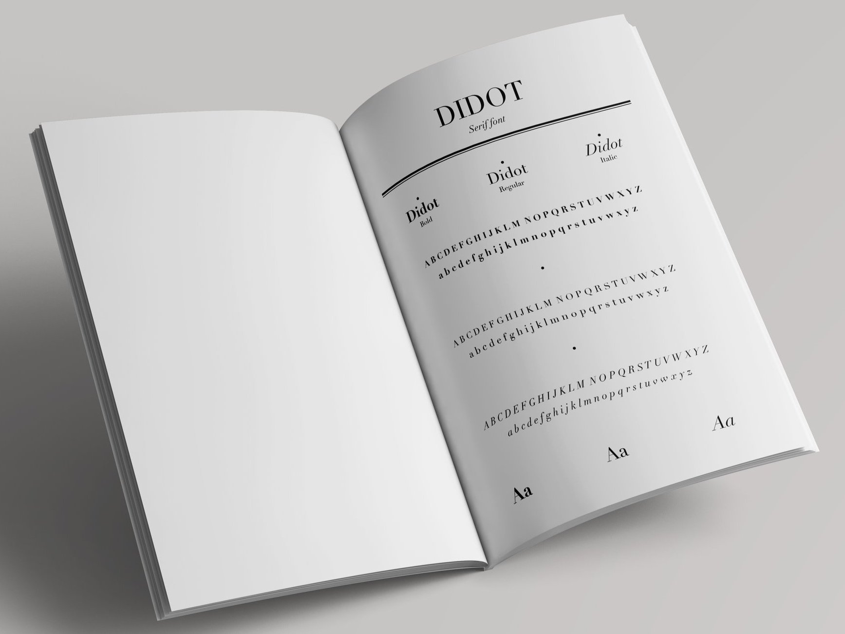
DIDOT
TYPOGRAPHY
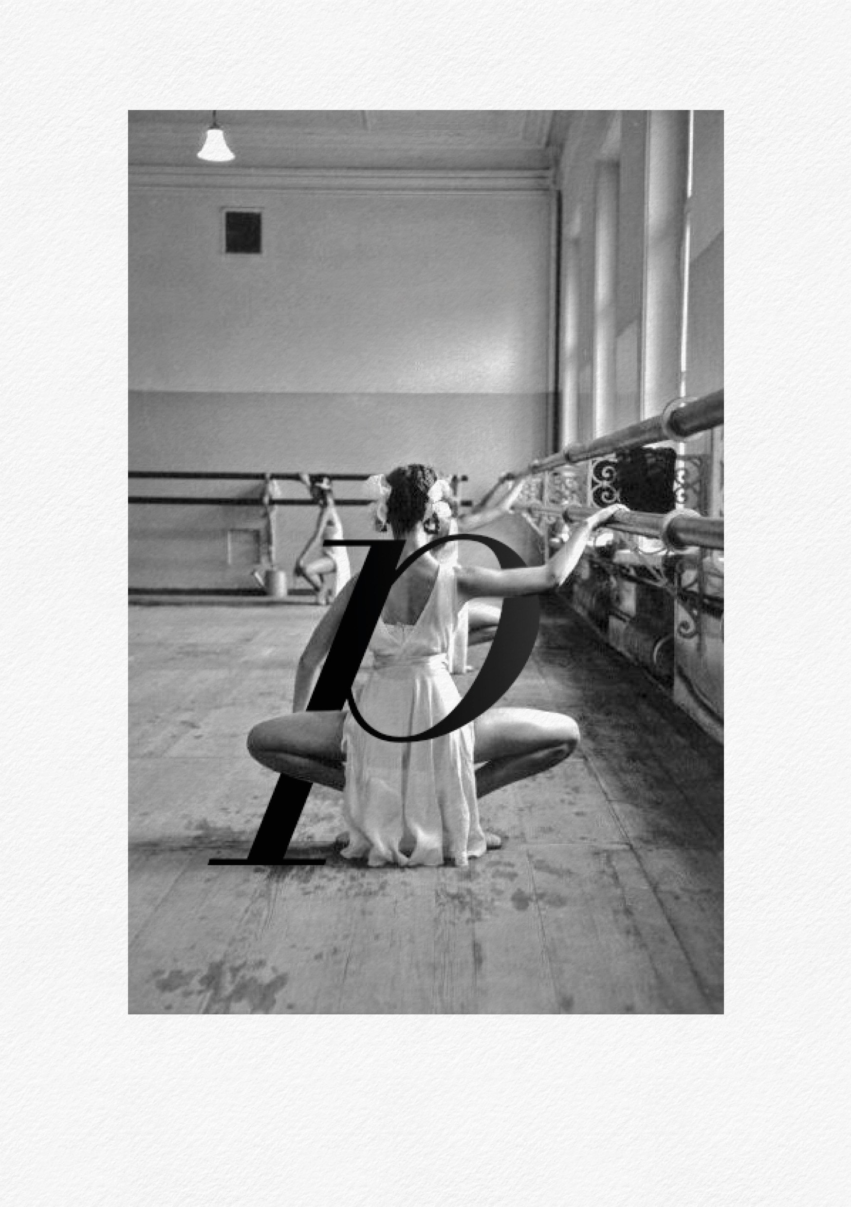
This project is about Didot, a font of great importance in the history of typography. It nostalgically takes me back to my university days when my professor explained the significance and use of different typefaces.
That lesson inspired my approach to testing and comparing various fonts, an approach that has remained constant over time.
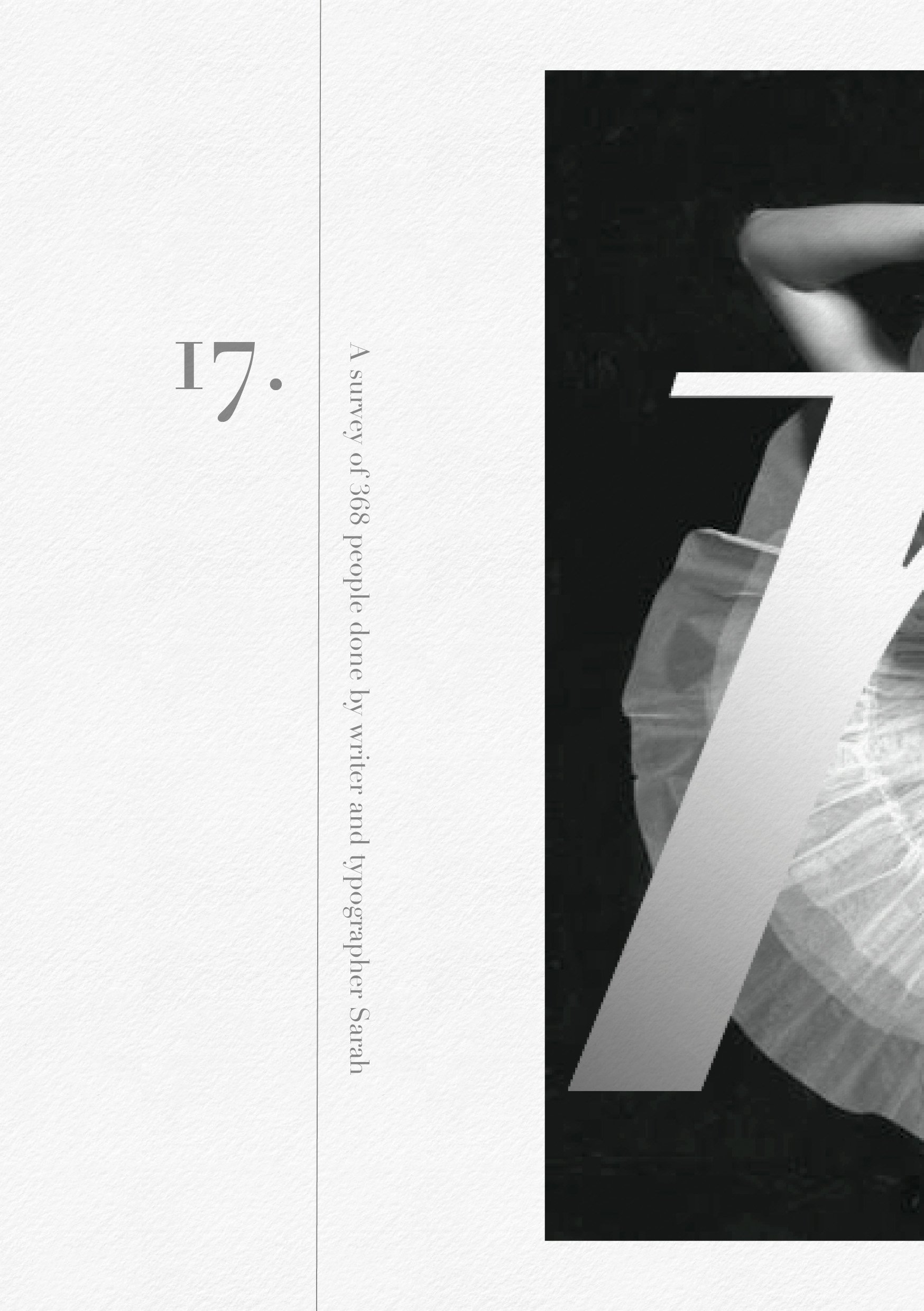
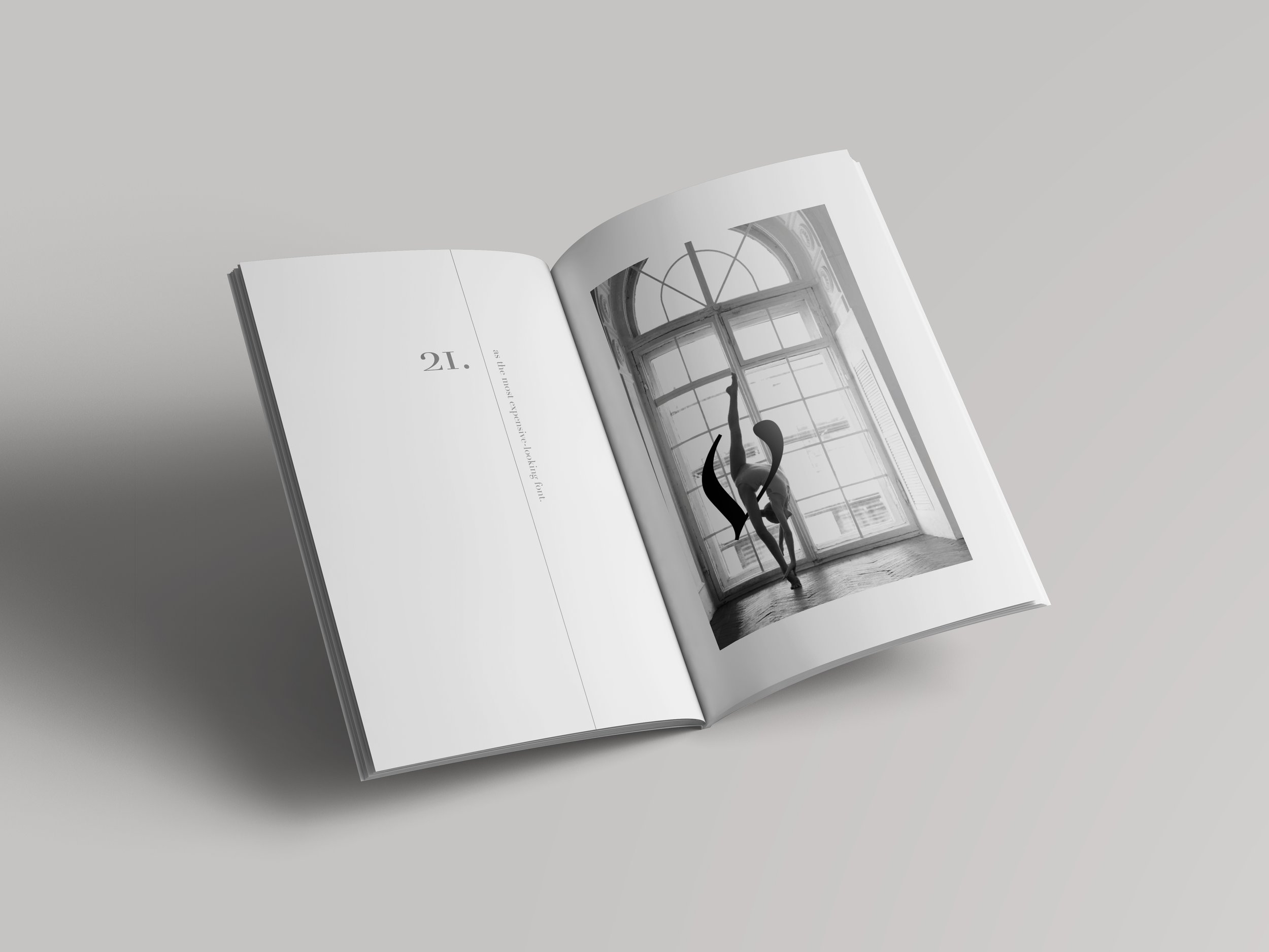
By observing the shape of the glyphs, I sought to capture their essence, envisioning them on the stage of a theater or in a ballet rehearsal room, merging them with the dancers.


HOW WOULD YOU HAVE IMAGINED THEM?