Sì.
BRANDING


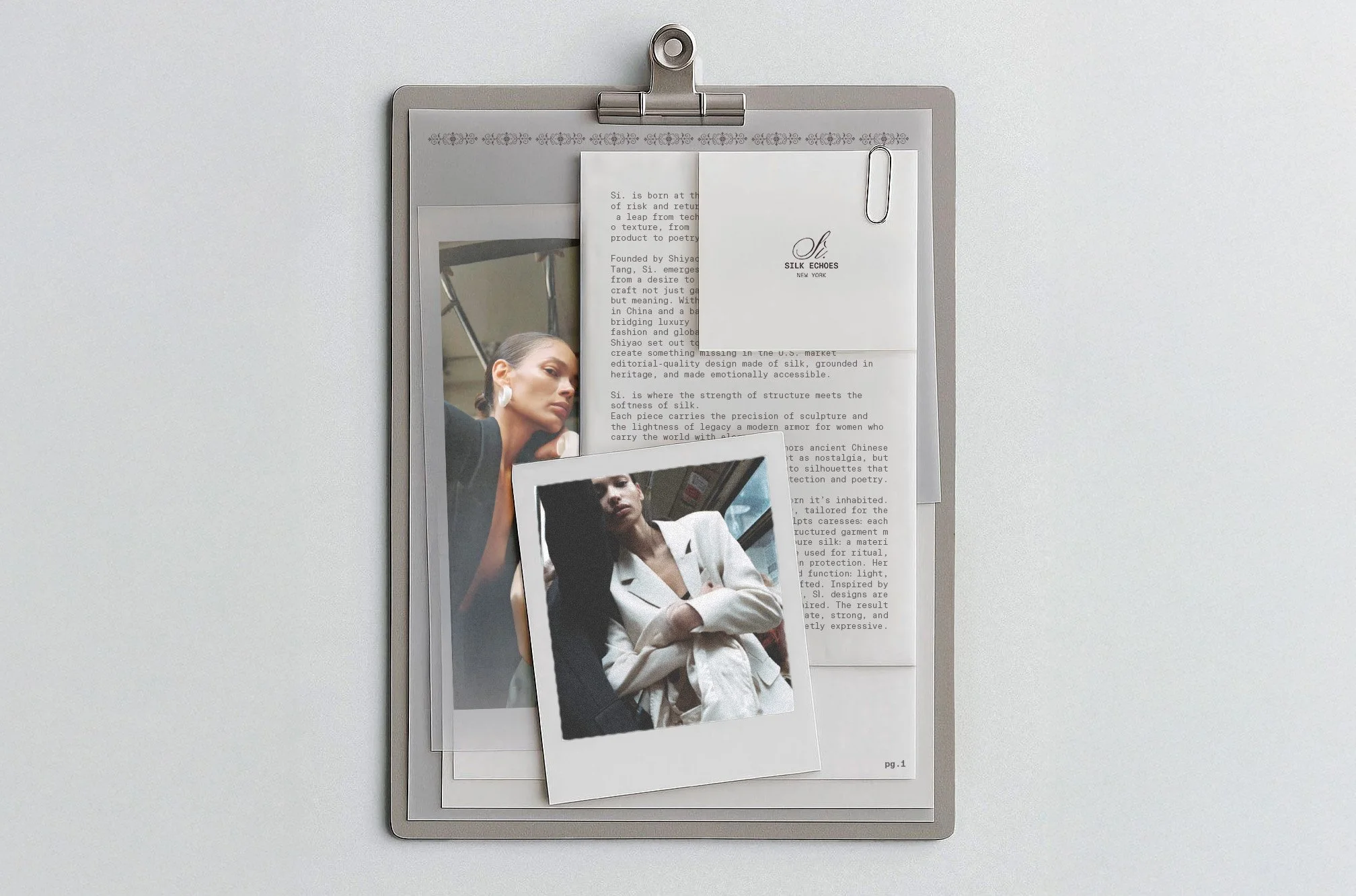
SÌ. is a womenswear brand focused on silk garments, merging Eastern craftsmanship with a contemporary global aesthetic. For SÌ., together with designer Shiyao Tang in New York, I developed a brand identity that is both poetry and wearable architecture: a project that marks my first global experience and celebrates branding as cultural storytelling.
PREMISE
Bringing to life a visual identity capable of dressing the modern woman with strength and grace. By intertwining Oriental cultural heritage with a contemporary aesthetic language. The positioning aimed to introduce to the West the perception of the know-how and the real quality of Eastern silk craftsmanship, documenting the making process and enhancing the perception of a garment that can be both elegant and functional for everyday life.
OUTCOME
The result is a complete visual identity that conveys the brand’s dual soul: strength and softness, protection and caress. The entire visual system: from palette to typography, from patterns to tone of voice, was built as a global, coherent, and layered language, able to engage with the U.S. market while preserving authenticity and deep roots, and perhaps one day capable of walking the streets of Paris or other European capitals.
DELIVERABLES
Brand Essence & Positioning:
mission, vision, values, and payoff
Visual Identity:
logo, colour palette, typography, and graphic systems inspired by digital embroidery and traditional Oriental ink painting
Art Direction:
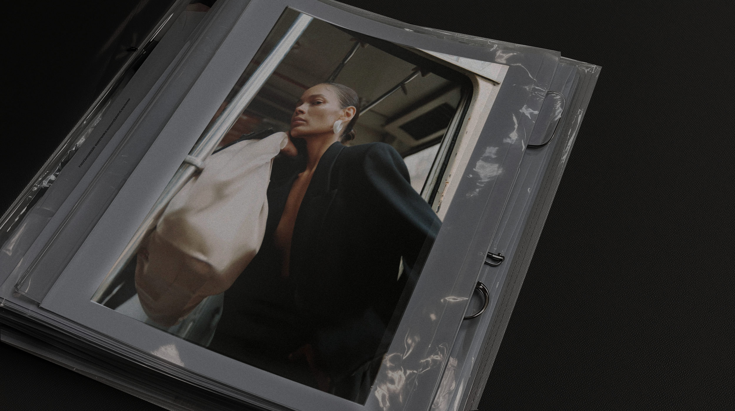
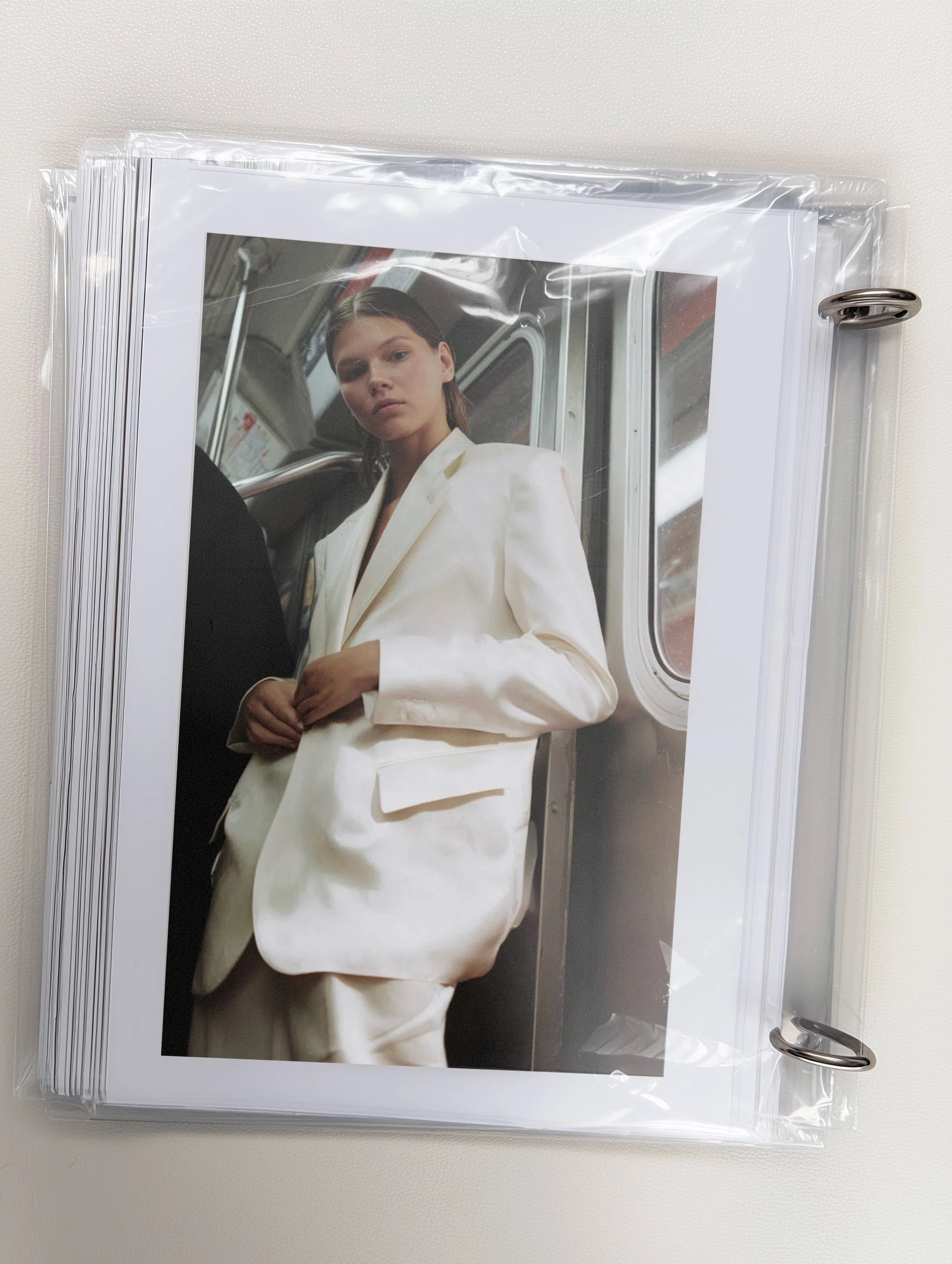
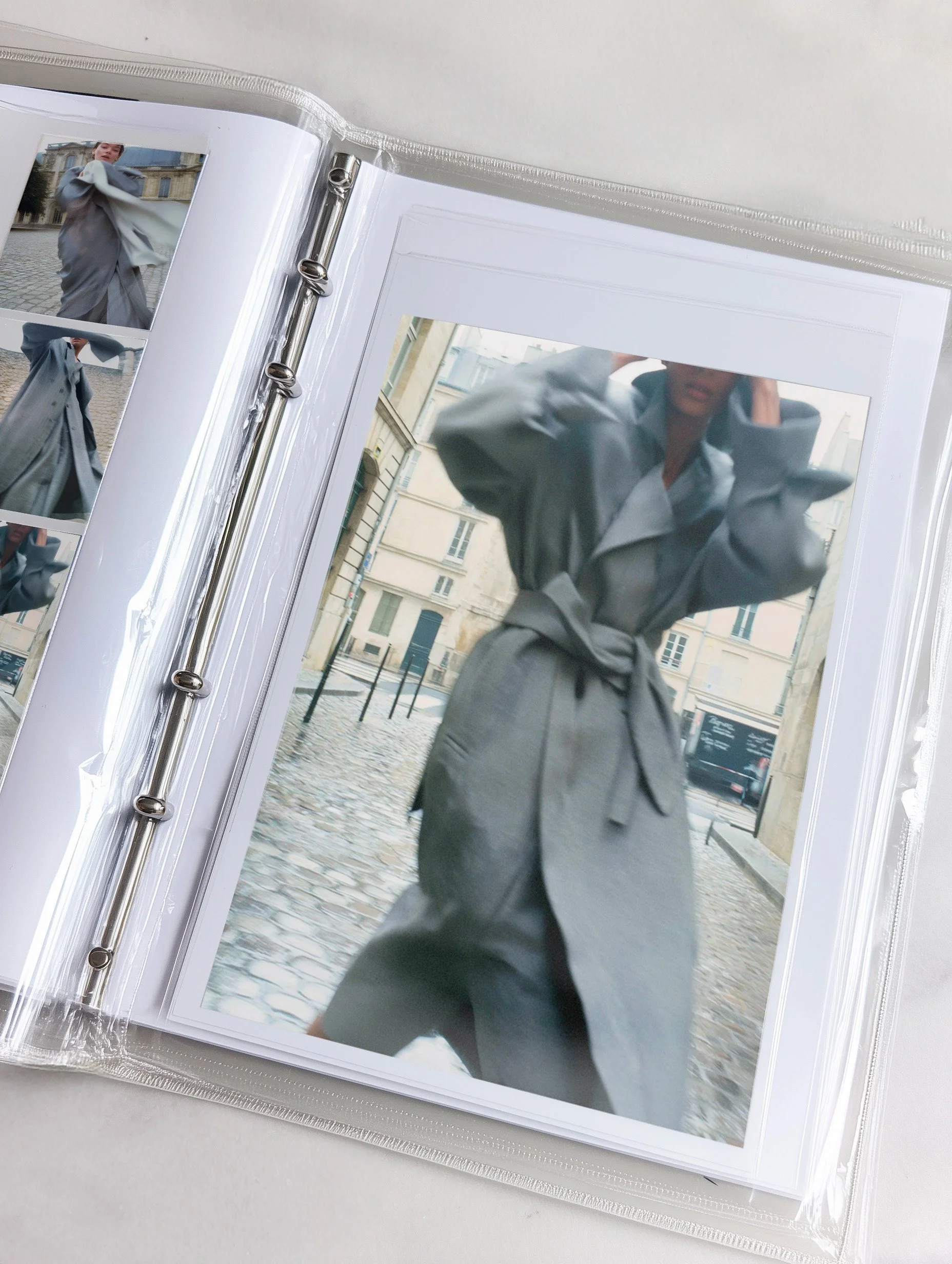
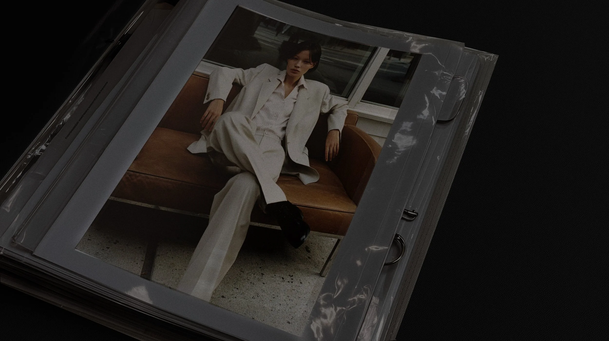
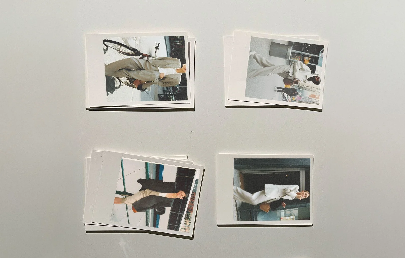
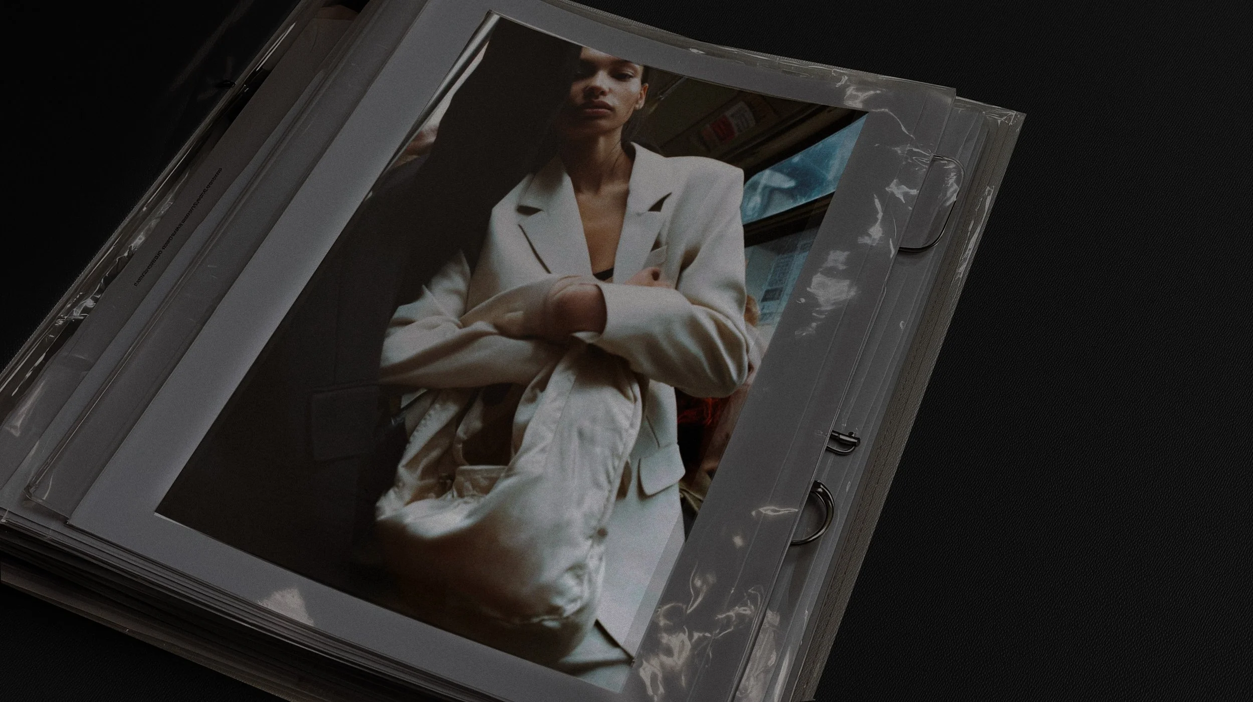
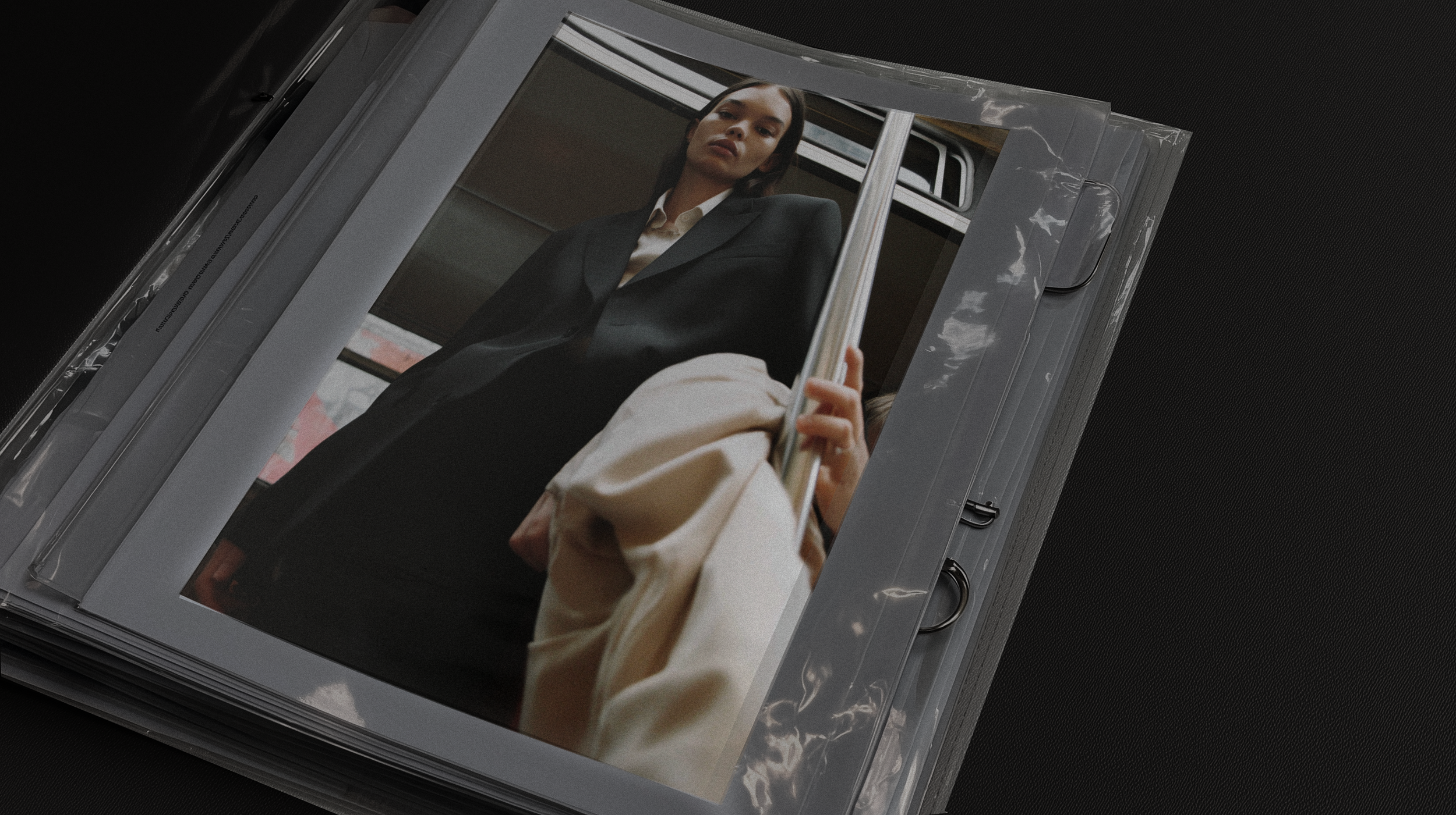
editorial photographic mood, visual storytelling, and guidelines for indoor/outdoor shoots
Packaging Design:
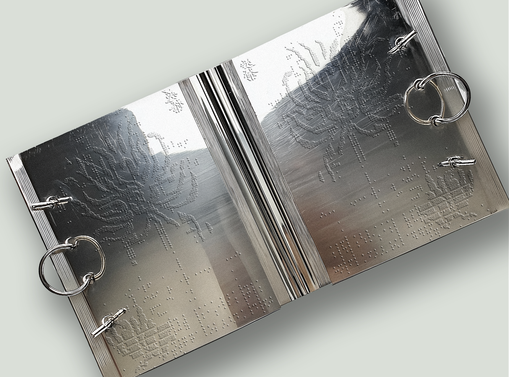
embossed paper solutions and eco-friendly textile pouches
Social Media Templates:
inspirational content, storytelling, and formats to launch the brand on the international market

CREATIVE IDEA
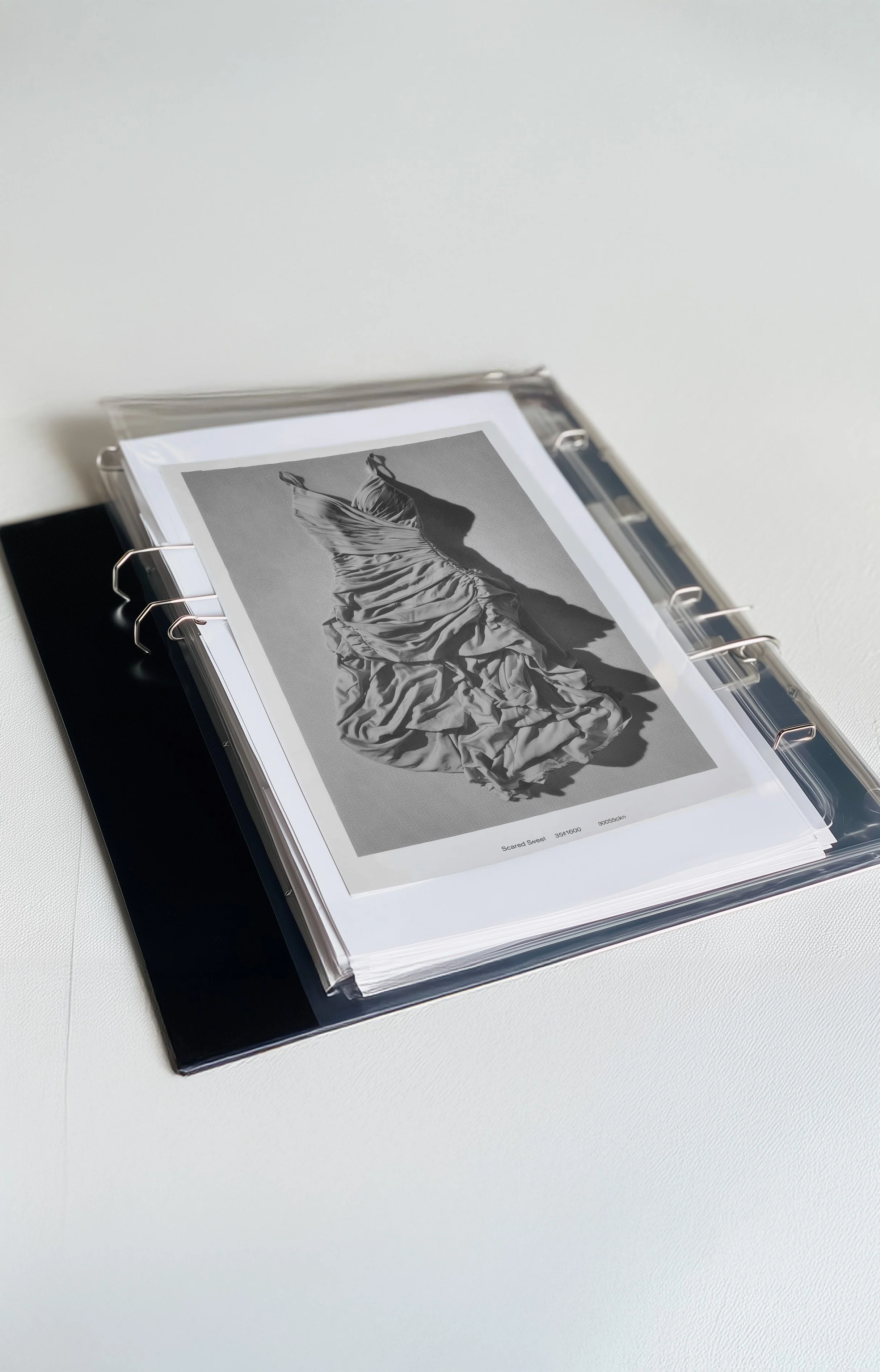
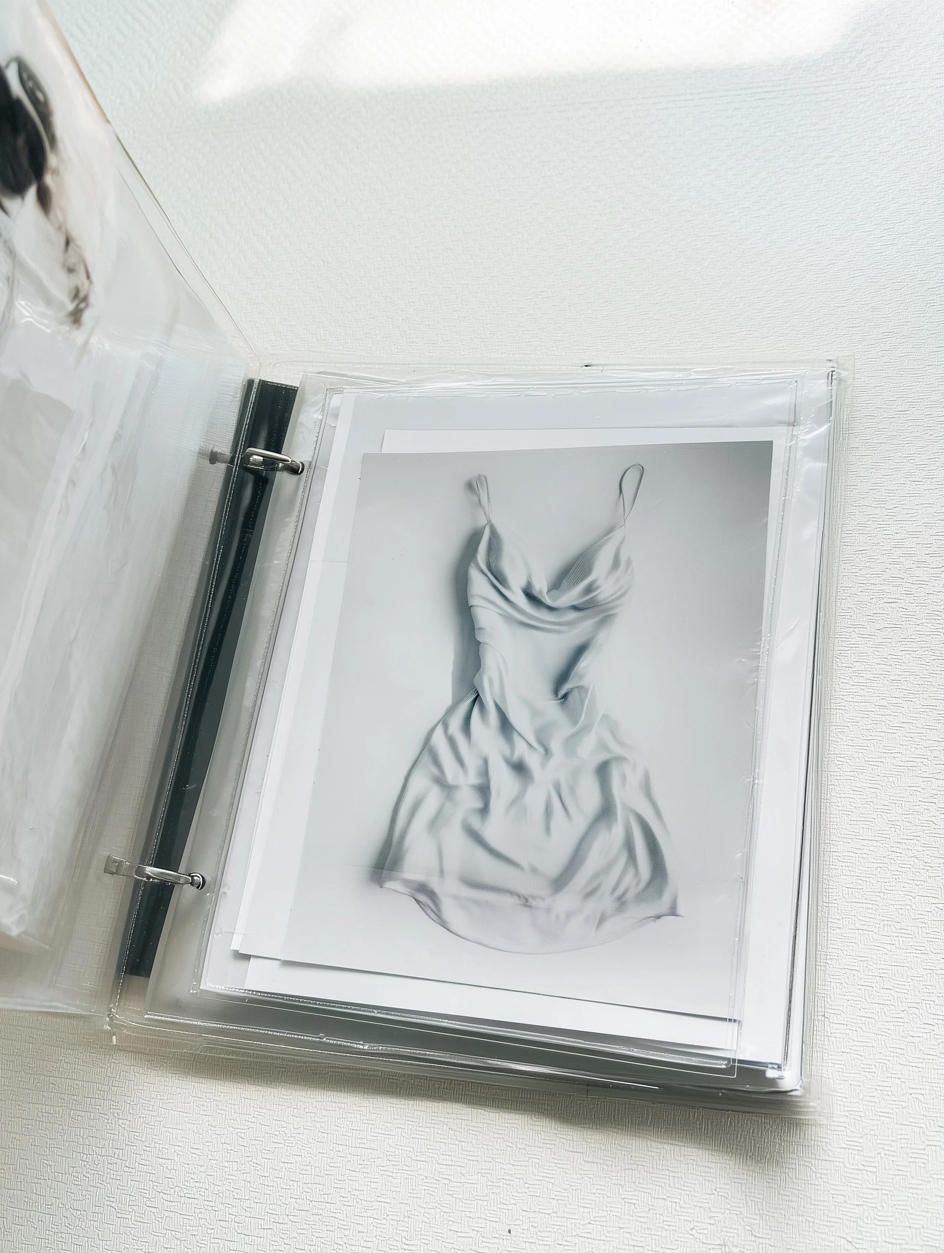
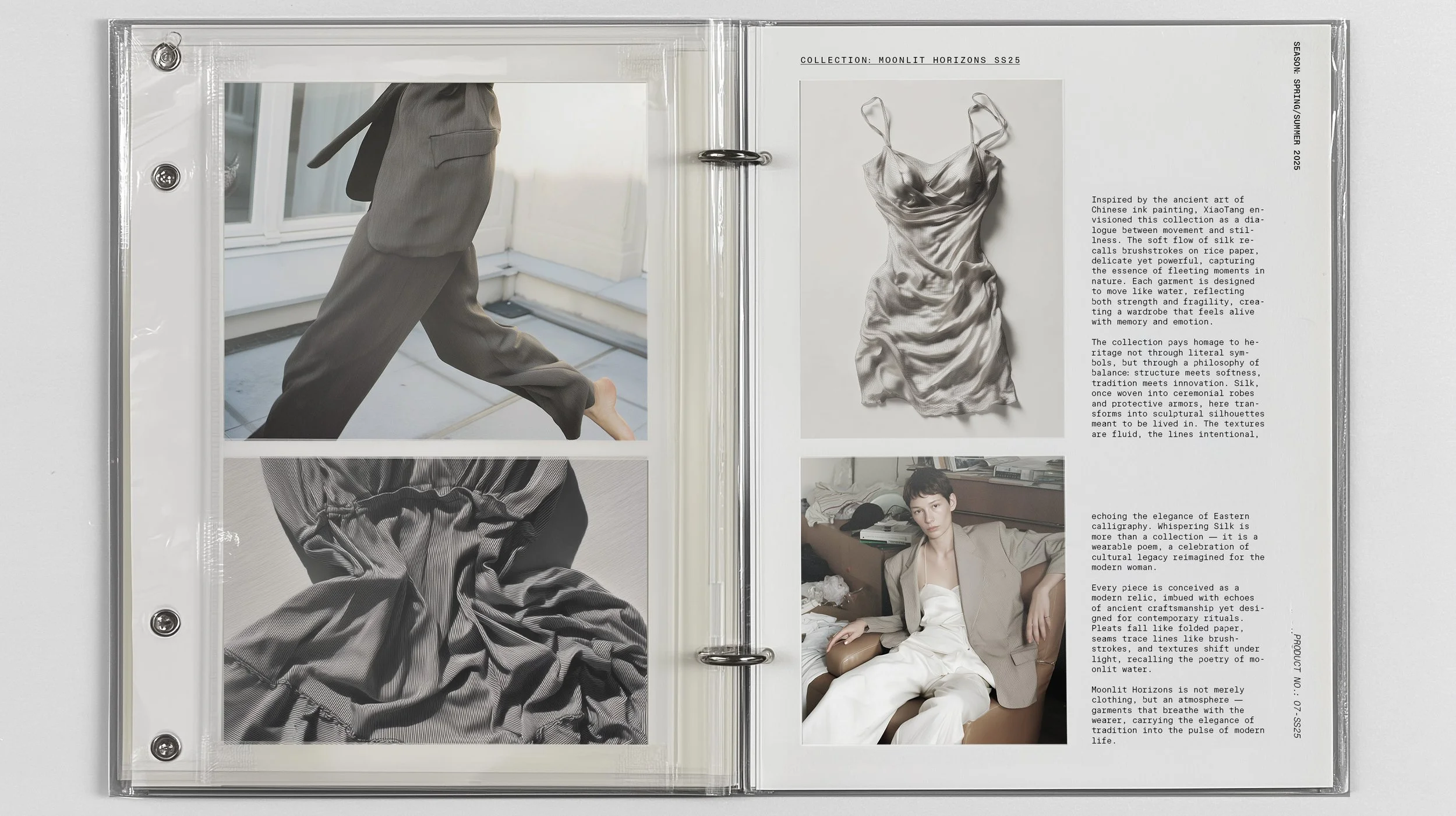
“Whispers of Heritage” defines Sì.’s style — an elegant aesthetic that merges structural minimalism with poetic fluidity. Silk is the protagonist: a material transformed into soft architecture, where every fold, cut, or seam expresses a quiet strength. Silk is not just fabric, it is a symbol and a memory. Each piece becomes a whisper of history, a gesture of love.



EXPERIMENTAL PATTERN
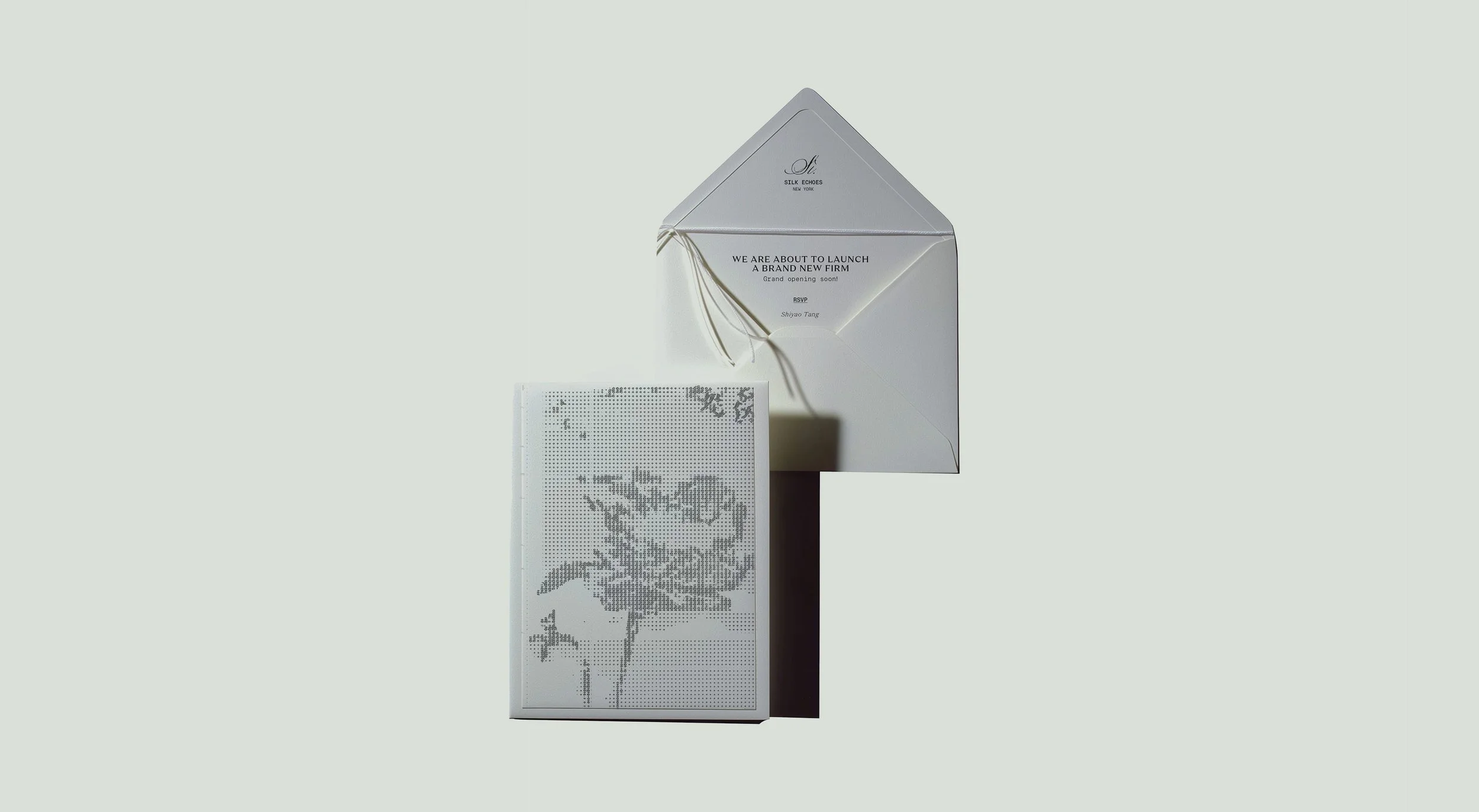
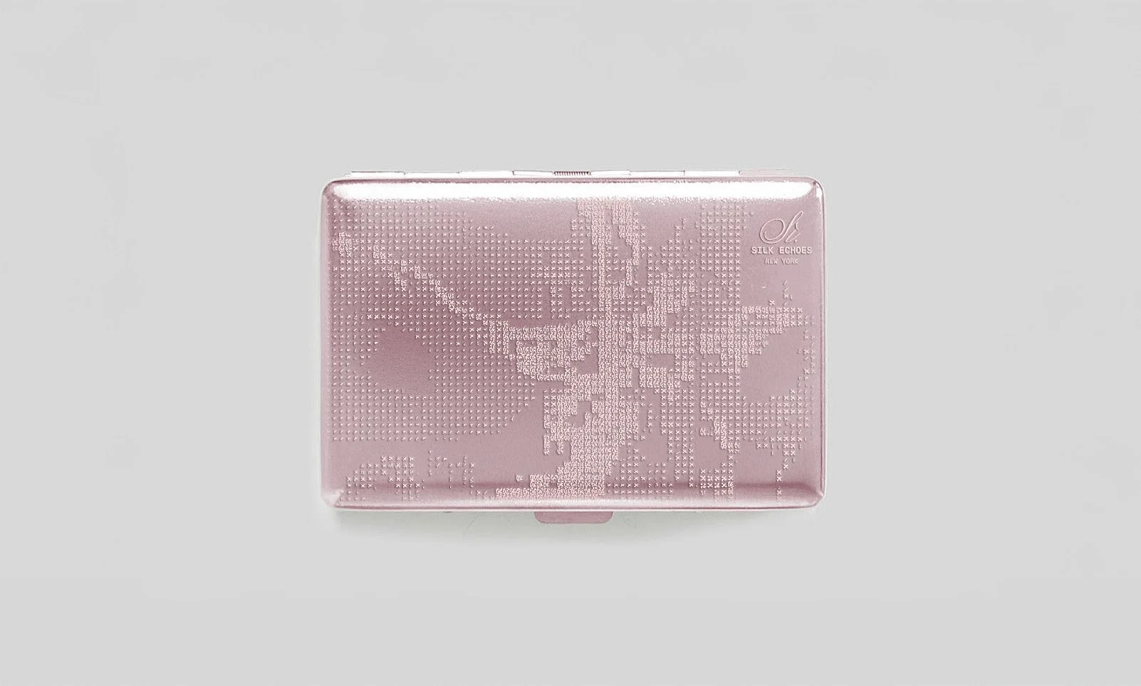
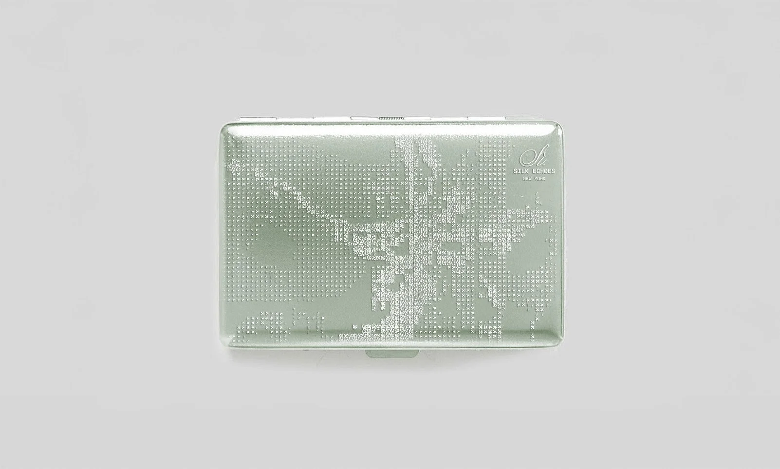
For the design of the floral patterns used in the packaging, a unique visual language has been developed by merging two seemingly contrasting aesthetics into a refined and contemporary balance: on one side, the fluid, expressive gestures of traditional Oriental ink painting (shui-mo hua); on the other, the structured, modular precision of digital cross-stitch embroidery.


MVP WIREFRAMES & DESIGN
Art direction and web refinement consultancy including brand-aligned mockups, UX/UI optimization, typography guidelines, and homepage cinematic design.
VISIT SOIRSI.COM
SHOOTING
I directed two types of photo shoots: a still life series that isolates the product as an object of observation, and a real-life set that captures relaxed yet intentional elegance. No overly posed shots or overly stylized environments ( it should feel like a captured moment from a real woman’s day, dressed with refined taste.) The goal is to communicate authenticity and wearability, highlighting how garments transition “from work to soirée” without compromising design or craftsmanship.
