SALINA
BRANDING

Salina is a swimwear brand with a visual, narrative, and emotional system built on the connection between body and sea — both fluid, imperfect, shaped by time, and capable of telling stories.
PREMISE
Salina is born from movement — a trajectory that crosses oceans and identities.
Much like the story of its founder, Sophia — between Venezuela, Peru, and Spain — the brand is shaped by water as an emotional and cultural throughline.
Salina is not just swimwear; it’s a system of salted veins connecting places, memories, and roots.A current that gives form to a new way of wearing the sea: with authenticity, freedom, and belonging.
OUTCOME
Salina desires to create a brand that speaks of swimwear not as a trend, but as something that settles on the skin like a memory.
Through in-depth market research — between editorial, sustainable, commercial, and aspirational brands — I identified a strategic gap: no one was telling the story of the body in a way that was sensory, raw, poetic, and accessible at the same time.
Salina positioned itself precisely there, as an alternative to glossy luxury and seasonal fast fashion. Its aesthetic is cinematic and emotional, rooted in lived experience.
The result is a brand that doesn’t chase trends, but builds an expressive space where the wearer can truly recognize themselves.
CREATIVE IDEA
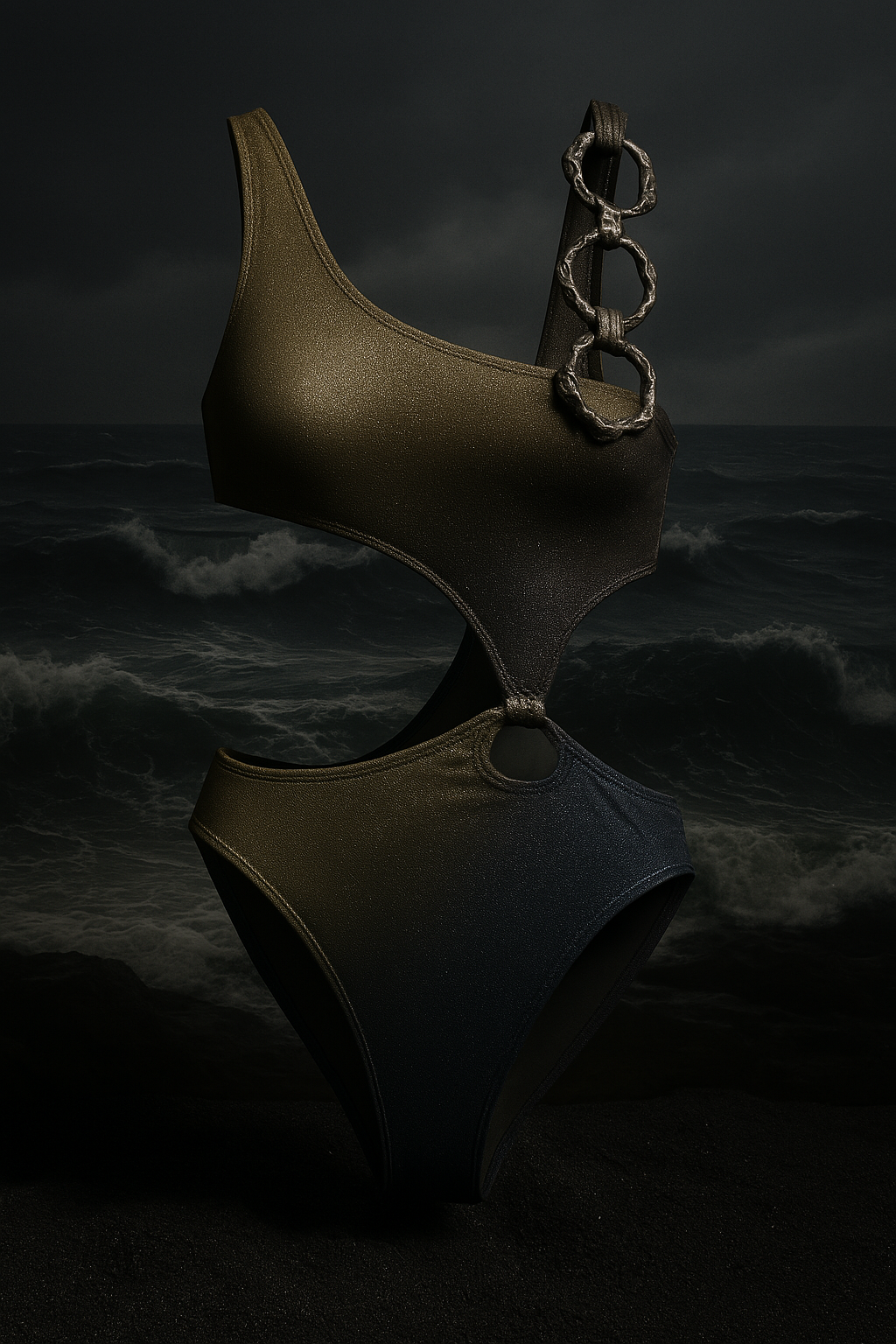
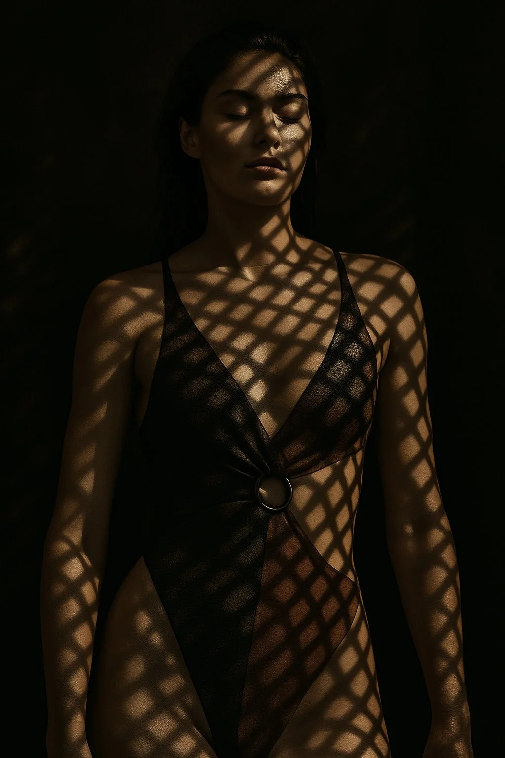
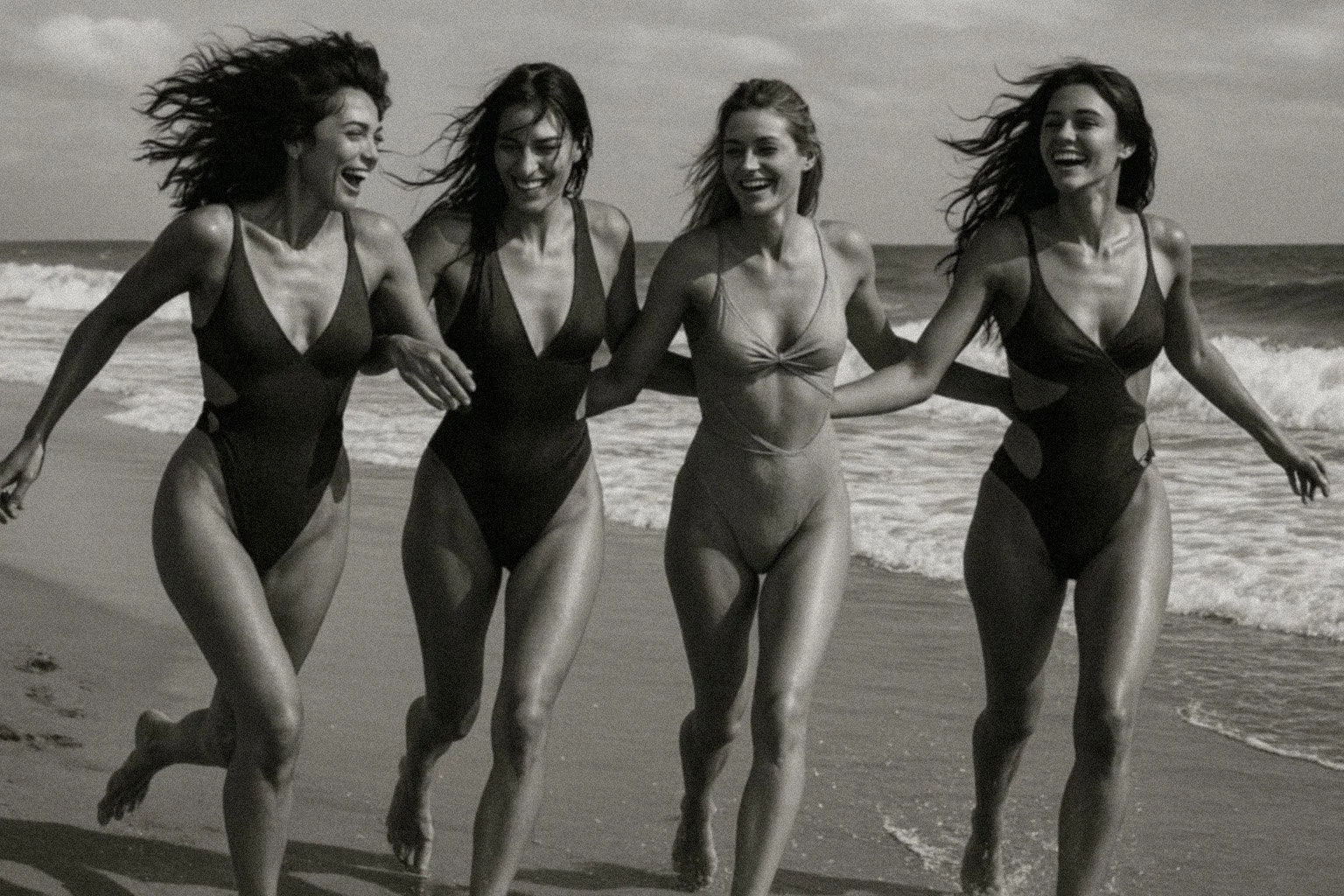
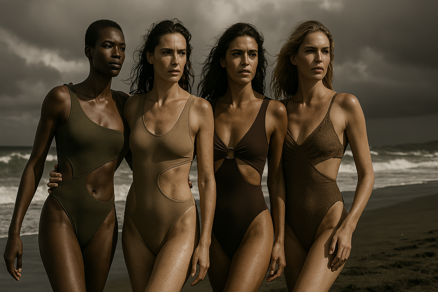
“Where Tides Rest” defines Salina’s style — raw, earthy, and authentic. It strips away mythology to celebrate the imperfect beauty of skin marked by sun, salt, and time. The body and the sea mirror each other — in textures, rhythms, and unique details. Salina speaks of experience, not perfection: swimwear worn like lived memories.
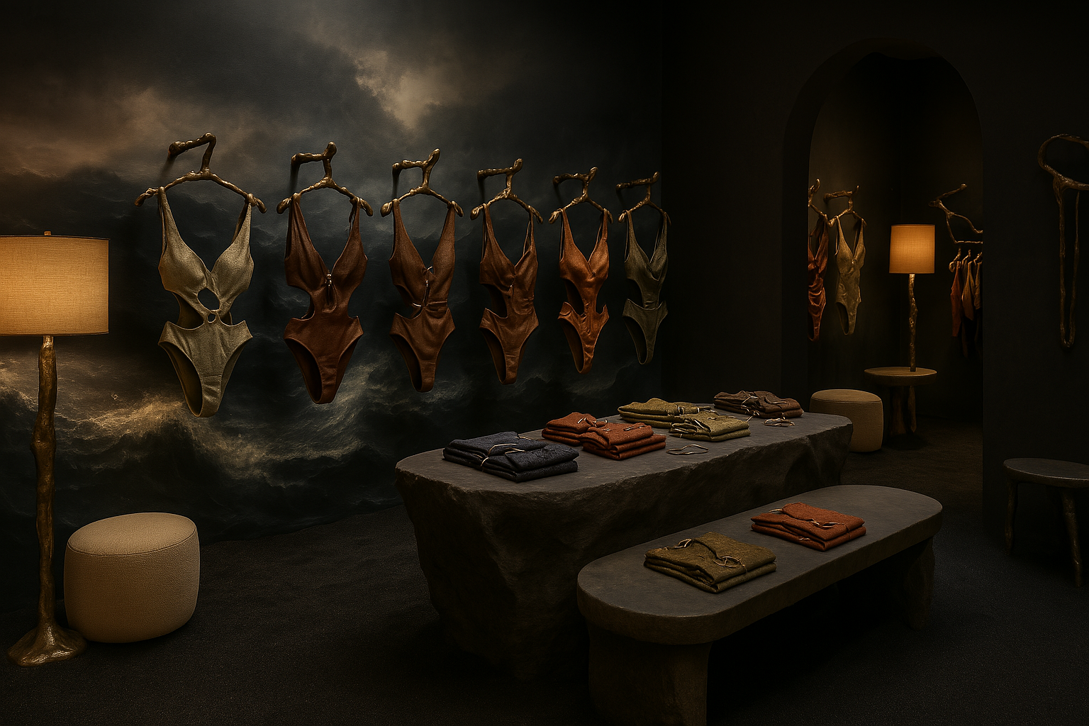
The visual language is warm and tactile, inspired by the traces left behind by summer — skin, waves, saline patterns. The palette blends sand and bronze with deep ocean blues and translucent water tones. The tone of voice is direct, emotional — made of short, grounded words that leave a mark.


FUTURE PROSPECTS
The strategic analysis didn’t stop at positioning. It served to imagine a future relationship with the audience — built through places, rituals, and objects. I envisioned a physical store aligned with the brand’s identity: quiet, fluid, immersive.
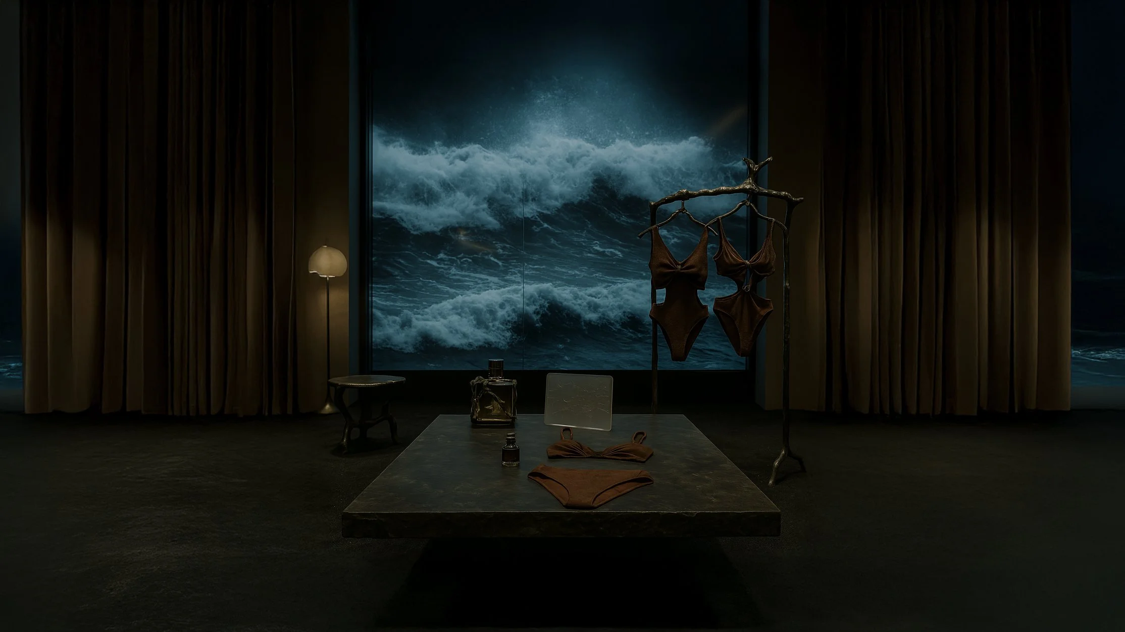
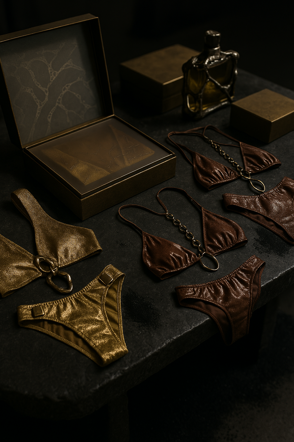


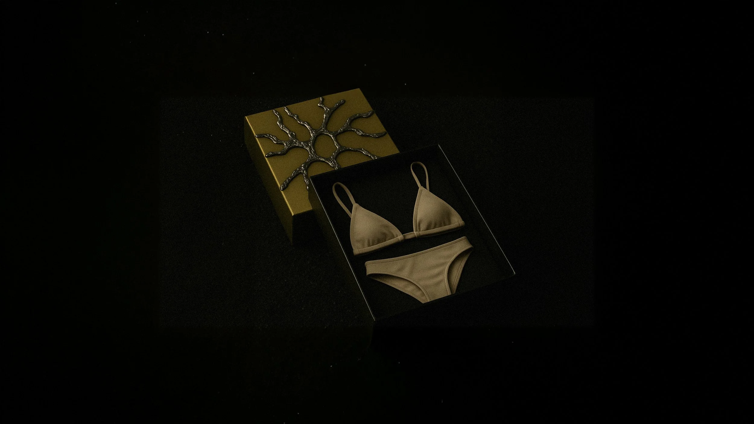
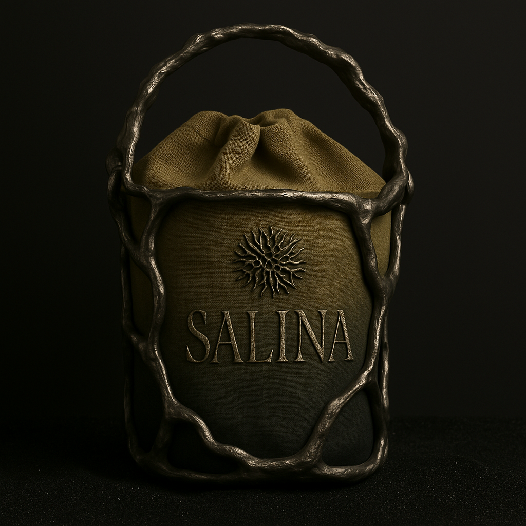
I also proposed coherent brand extensions: labels made from production surplus fabric, reusable bags designed as narrative packaging, and a future fragrance line tied to the idea of memory on the skin.


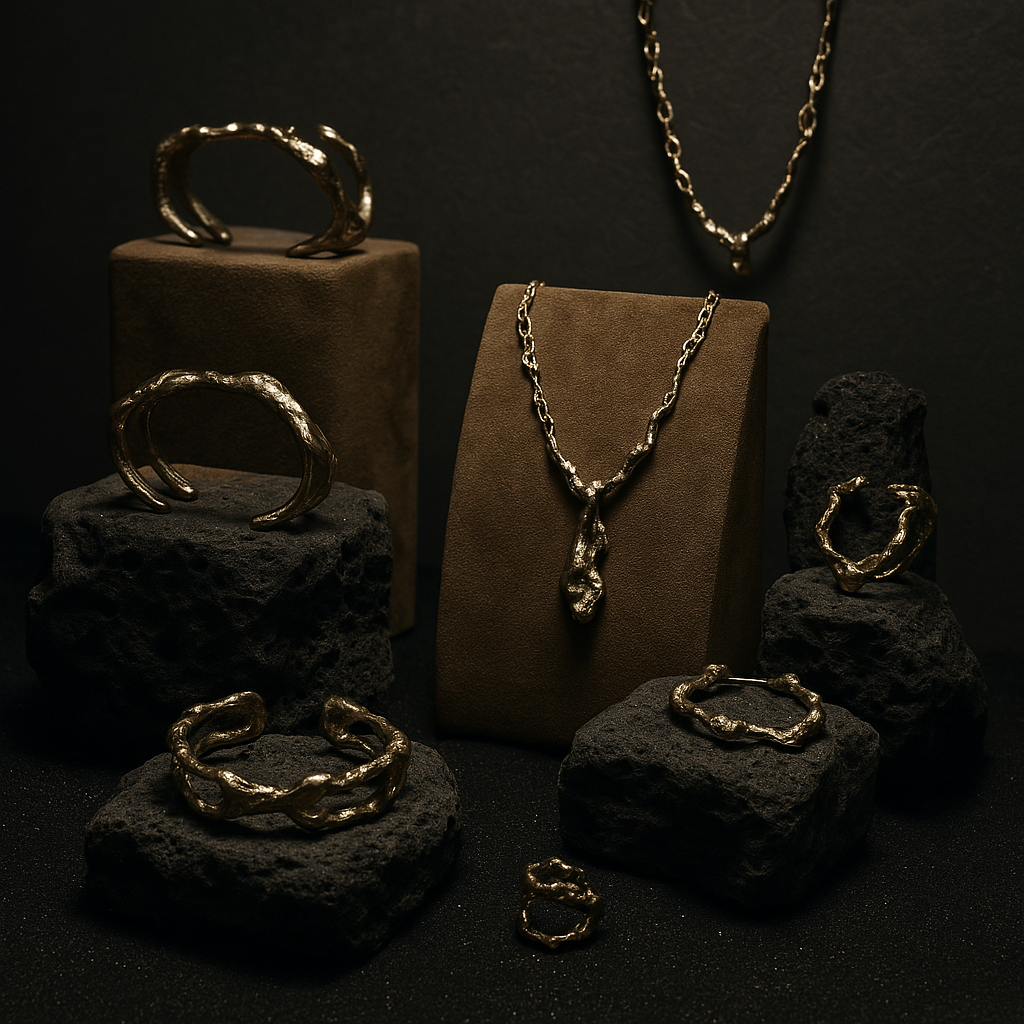
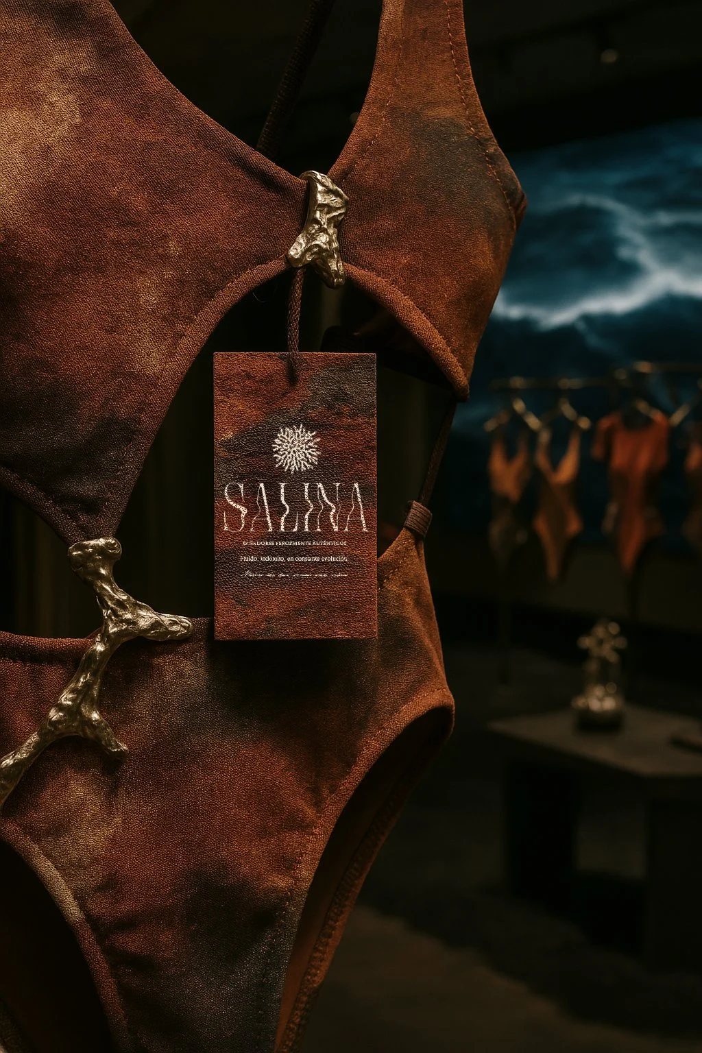
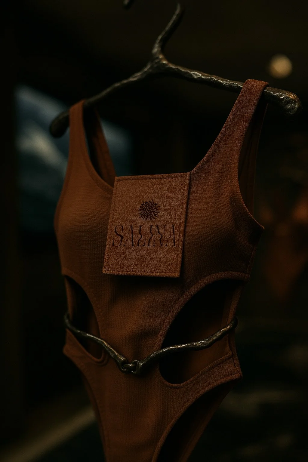


I directed two types of photo shoots: a still life series that isolates the product as an object of observation, and a real-life set that captures it as a lived gesture — skin, light, salt.