MANI IN PASTA
BRANDING
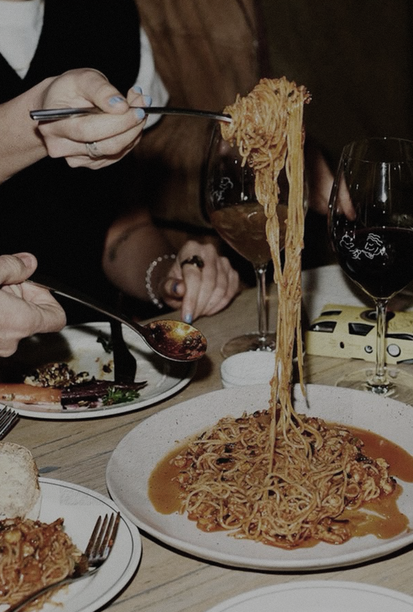
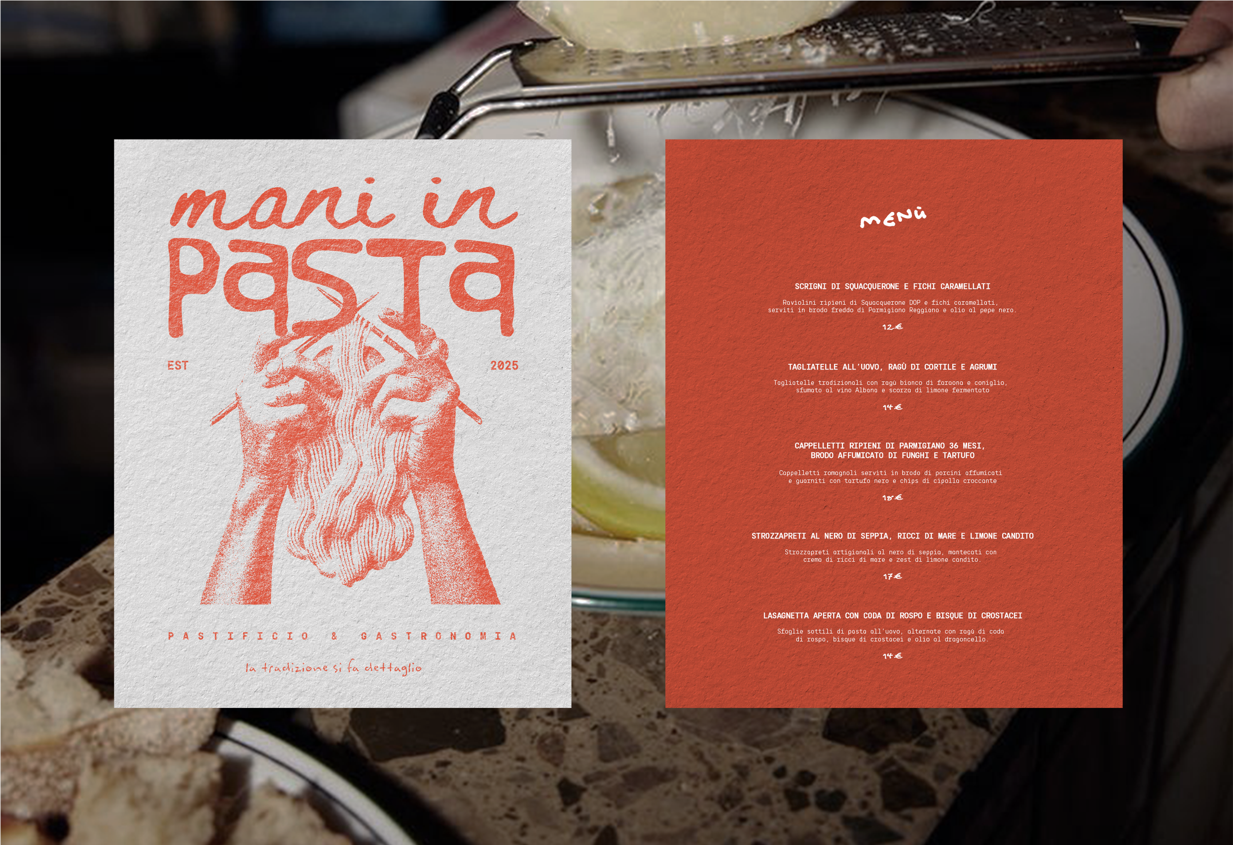
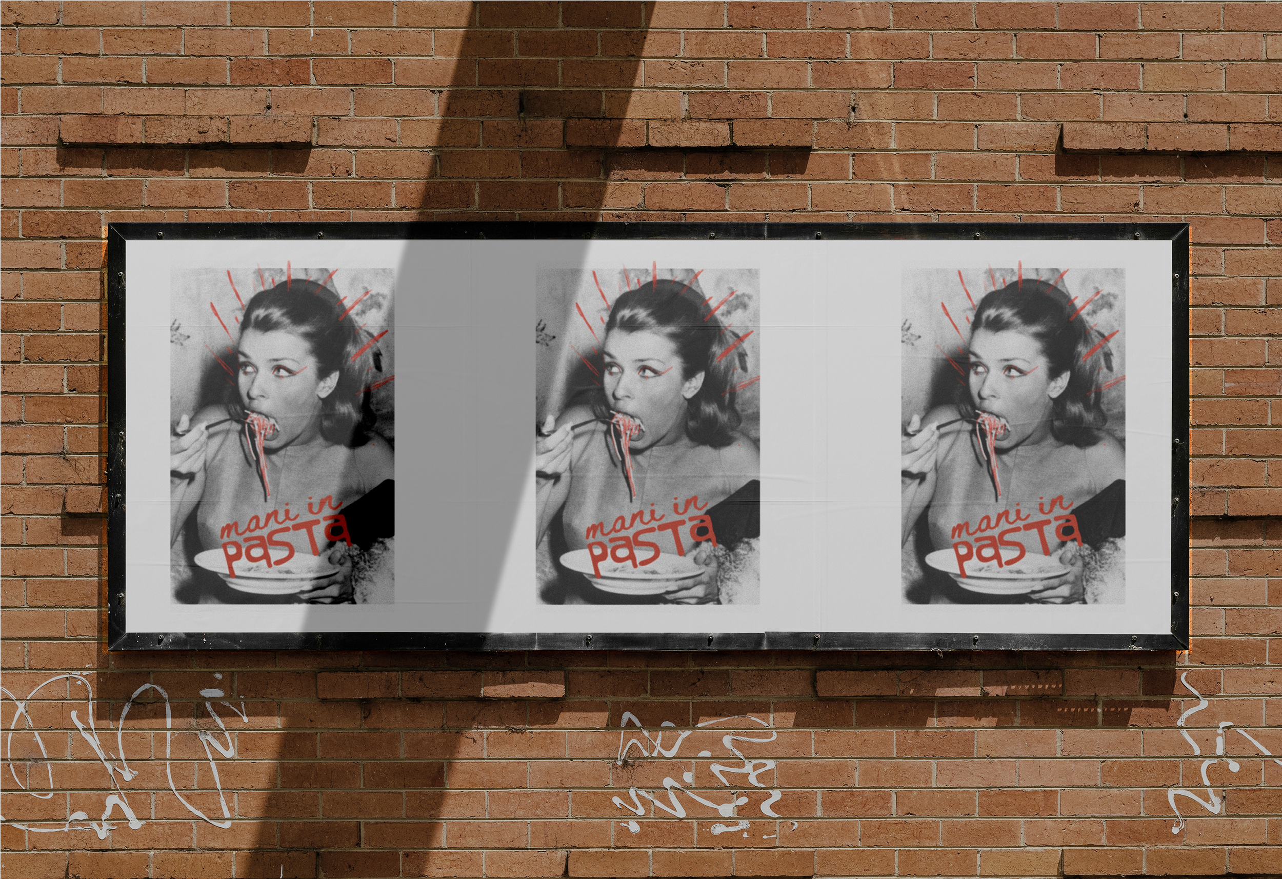
Mani in Pasta is a project that reinterprets the craftsmanship of fresh pasta with a fresh, playful, and contemporary visual language. A brand that speaks to a new generation of food lovers with an ironic tone and a distinctive aesthetic, blending tradition and modernity without ever taking itself too seriously.
OUTCOME
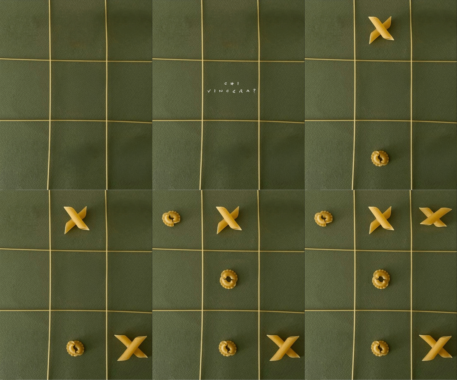
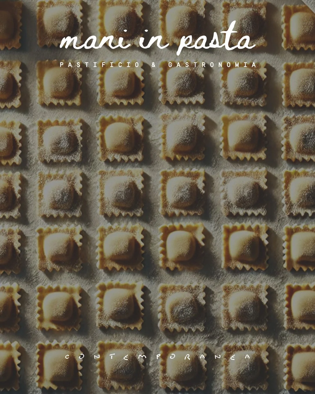
The entire visual system was designed to be instantly recognizable, dynamic, and perfectly adaptable across different touchpoints while maintaining its vibrant energy. The key outputs of the project include: a bold and modular visual identity, designed to surprise and create engagement; An ironic and engaging brand language, bringing a young audience closer with a friendly and unconventional tone of voice; A flexible graphic system, playing with patterns, textures, and layouts that evoke the world of fresh pasta in an unexpected and original way.
CREATIVE IDEA
The concept stems from the idea of making fresh pasta more than just a product—transforming it into a visual and sensory experience told through design. The creative direction combines the brand’s artisanal essence with a pop and contemporary aesthetic.
The color palette recalls the warm tones of egg pasta but is energized by vibrant and contrasting accents. The typographic system balances elegant fonts with more irreverent ones, creating a playful equilibrium that makes the brand accessible, modern, and highly recognizable.
CONCEPT
Mani in Pasta is not just a visual identity but a true storytelling system that turns tradition into a visual game. The design is dynamic, fluid, and capable of engaging the audience through graphics, packaging, and digital content that surprise and entertain.
The result? A brand that celebrates the culture of fresh pasta in a contemporary way, maintaining a strong connection to the authenticity of the product but with a bold personality that stands out and captivates.
